Properties panel
Select a block and the right-hand panel becomes its control surface. Everything about that block — how it sits, how it looks, what it contains — lives here, split across three tabs.
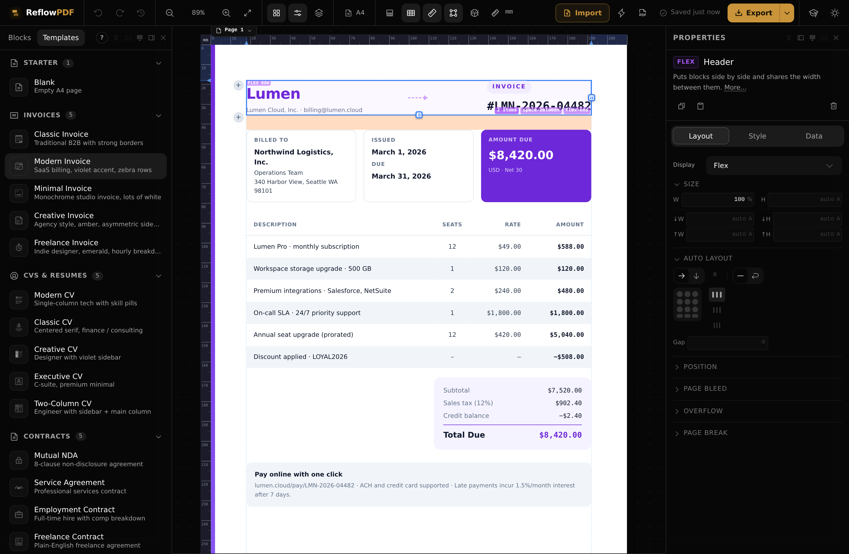
Layout tab
Where the block sits and how it arranges its children: display (block, flex, grid, inline…), size (width, height, min/max), position (static, relative, absolute) and spacing (the visual margin/padding box). When the block is a flex or grid container, this tab also exposes its direction, gaps, and alignment — the icons you can see in the screenshot above.
Style tab
How the block looks:
- Colours — text and background.
- Typography — font family, size, weight, line height, alignment.
- Borders — width, style, colour and radius.
- Opacity and shadow.
Data tab
The block's content and attributes — the parts that aren't visual styling. For an image that's its source and alt text; for a link, the URL; for a table, its structure. The tab adapts to the selected block.
Nothing selected
With no selection the panel shows a short hint instead of controls — click any block on the page (or a row in Layers) to bring its settings up.
Note