Editing on mobile
On a phone or tablet the editor switches to a touch-first layout. Touch has no hover and no right-click, so the desktop affordances are replaced with thumb-friendly ones — and a couple of things work deliberately differently.
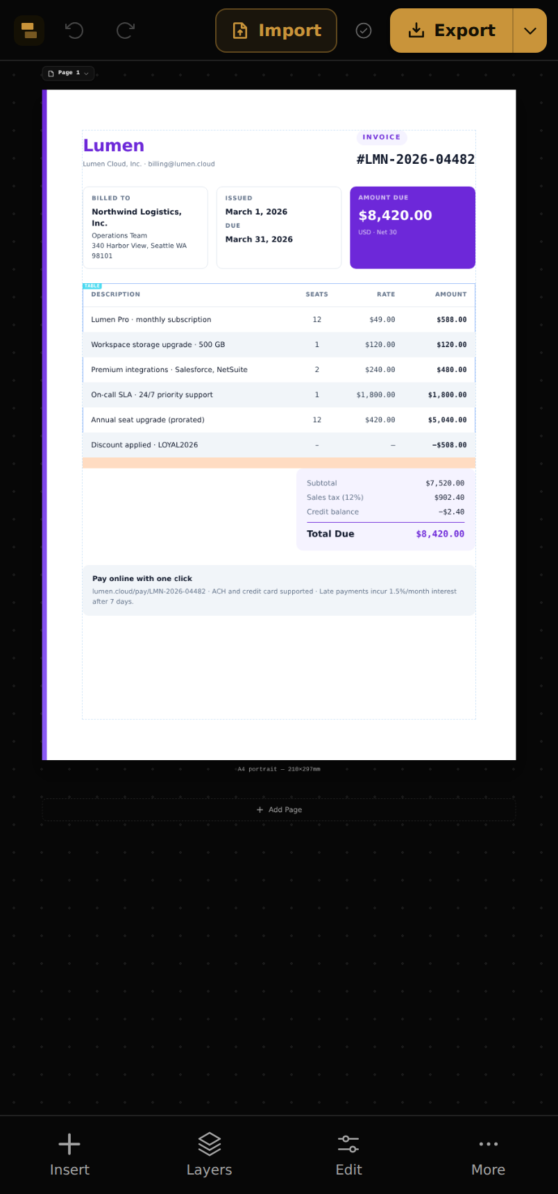
The mobile layout
- Top bar — logo, undo/redo, Import and Export.
- Bottom nav — Insert (the block library), Layers, Edit (properties for the selected block) and More.
- More — page setup, view options, theme, Templates, and replaying the walkthrough.
Tap a block to select it (a tap replaces the desktop click). Pinch to zoom, drag with one finger to pan. The breadcrumb above the canvas drills into parents, just like on desktop.
The selection toolbar
Select a block and a floating toolbar appears with its primary actions: Edit (open properties), Move, Duplicate, Delete and Deselect.
Moving without dragging
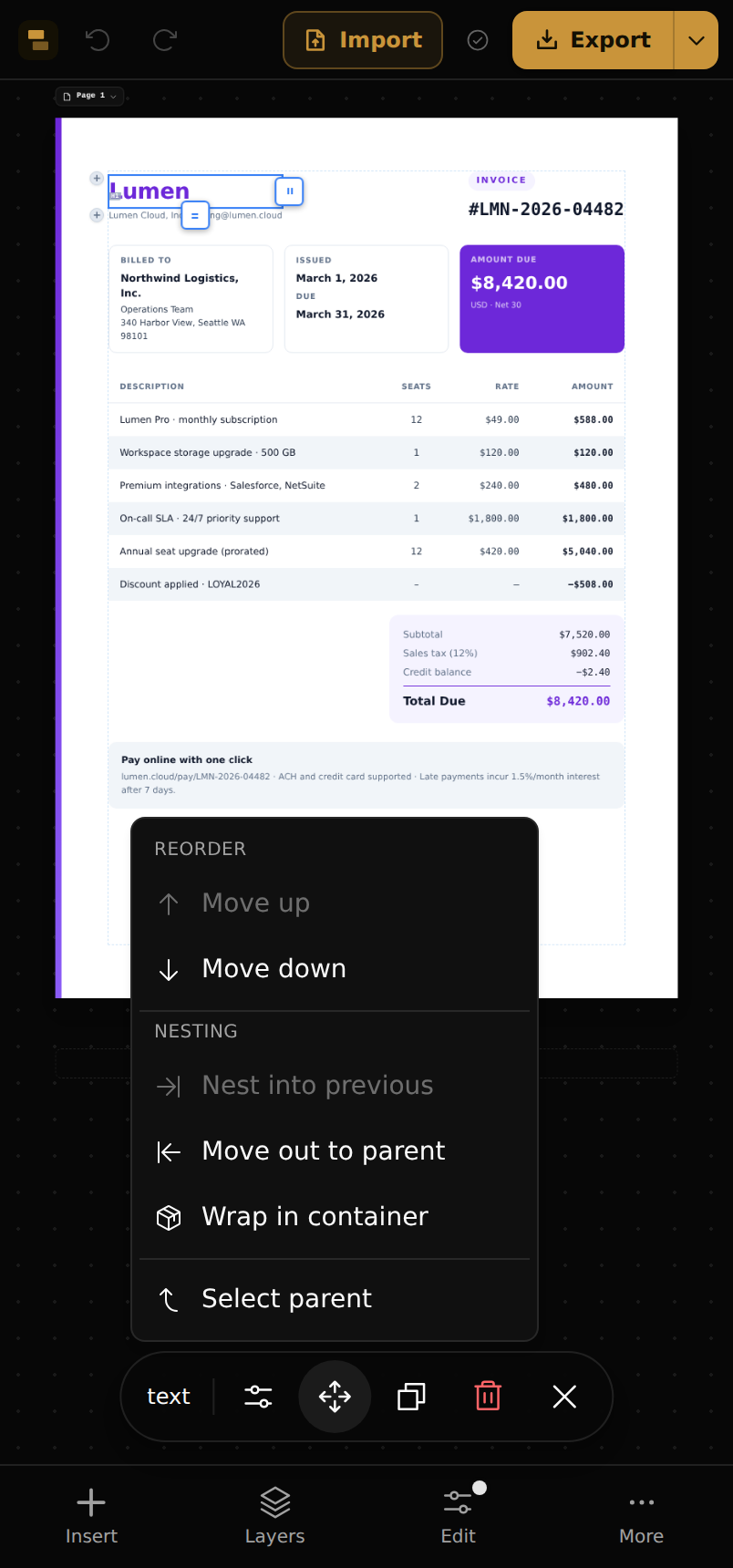
On touch, dragging elements around the canvas is off by design — it was fiddly and fired accidental moves. Instead, tap Move for a precise menu:
- Move up / down — reorder among siblings.
- Nest into previous — move the block into the sibling above it.
- Move out to parent — lift it up one level.
- Wrap in container and Select parent.
Note
The Layers panel (bottom nav) is the other way to rearrange on touch — the same tree, reorder and re-nest as on desktop.