-webkit-mask
below the visible threshold: 2 of 2 examples match Chrome
compat
Differs from Chrome only by anti-aliasing: no pixel is more than 3 of 255 apart on any colour channel, apart from places that differed as much without the declaration. Curves, rotation, gradients and translucent colours land here.
What the specification says
| Syntax | <mask-layer># |
|---|
The measurements
2 examples, both match Chrome. Each is one declaration on a small page, drawn by Chrome and by our engine. Drag on a picture to move the line between them.
-webkit-mask:url(data:image/gif;base64,…) no-repeat 20px 20px / 100px 60px
same effect as Chrome
| Pixels that differ from Chrome | 0 |
|---|---|
| The same, on the page without the declaration | 0 |
| Largest difference on one colour channel | 0 of 255 |
| The same, on the page without the declaration | 0 of 255 |
Identical to Chrome.
-webkit-mask:linear-gradient(90deg,#000 0 60%,transparent)
below the visible threshold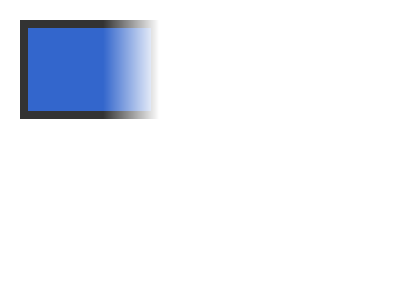
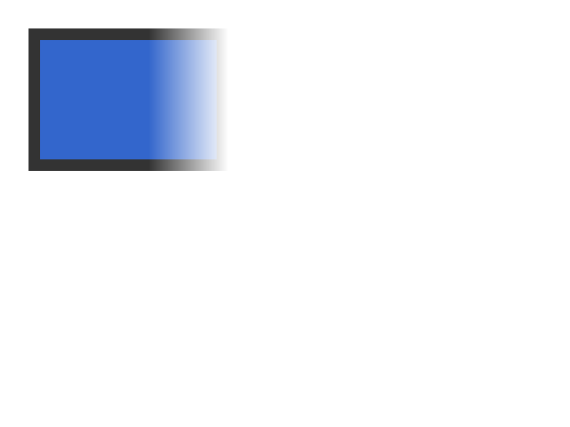
| Pixels that differ from Chrome | 22,251 |
|---|---|
| The same, on the page without the declaration | 0 |
| Largest difference on one colour channel | 3 of 255 |
| The same, on the page without the declaration | 0 of 255 |
What differs is anti-aliasing only.
Which values were measured
A match on one example means a match at the value tried. The property’s grammar has 3 branches, and 2 of them carry a measurement.
| Value | Measured |
|---|---|
linear-gradient(90deg,#000 0 60%,transparent) | below the visible threshold |
url(data:image/gif;base64,…) no-repeat 20px 20px / 100px 60px | same effect as Chrome |
none | not measured |
Measured against Chrome 148.0.7778.96 on 5 November 2026, with up to 40 candidate values tried per property. How it was measured